Furscription
E-prescribing for veterinary practices, replacing a stack of faxes, phone calls and one-portal-per-pharmacy with a single queue a vet can clear between appointments.
- Role
- UX/UI Designer
- Tools
- Figma
Overview
Furscription is prescription software for veterinary clinics. It lets a practice e-prescribe to any pharmacy (online, local, or compounding) and handle the refill requests that come back from pet owners, all from one dashboard, with client and patient data pulled straight from the practice's existing management system.
Contribution
I joined while Furscription was scaling, and that shaped the brief: make the product feel seamless for a far larger user base than the one it had originally been built around. Most of my work was redesign rather than new surface area, reworking the flows a vet touches every day so they hold up without anyone there to explain them.
Problem
Before software like this, a prescription left the clinic as a fax, a phone call, or a handwritten pad sheet, and every online pharmacy had its own portal with its own login. A vet finishing an appointment had to remember which channel this particular pharmacy wanted, re-key the client's address and the pet's weight by hand, and then field the callback when something was illegible. The task isn't complicated; it's just repeated forty times a day, and every repetition is a chance to transcribe a dose wrong.
Process
1 / 6
Start with who the prescription is for
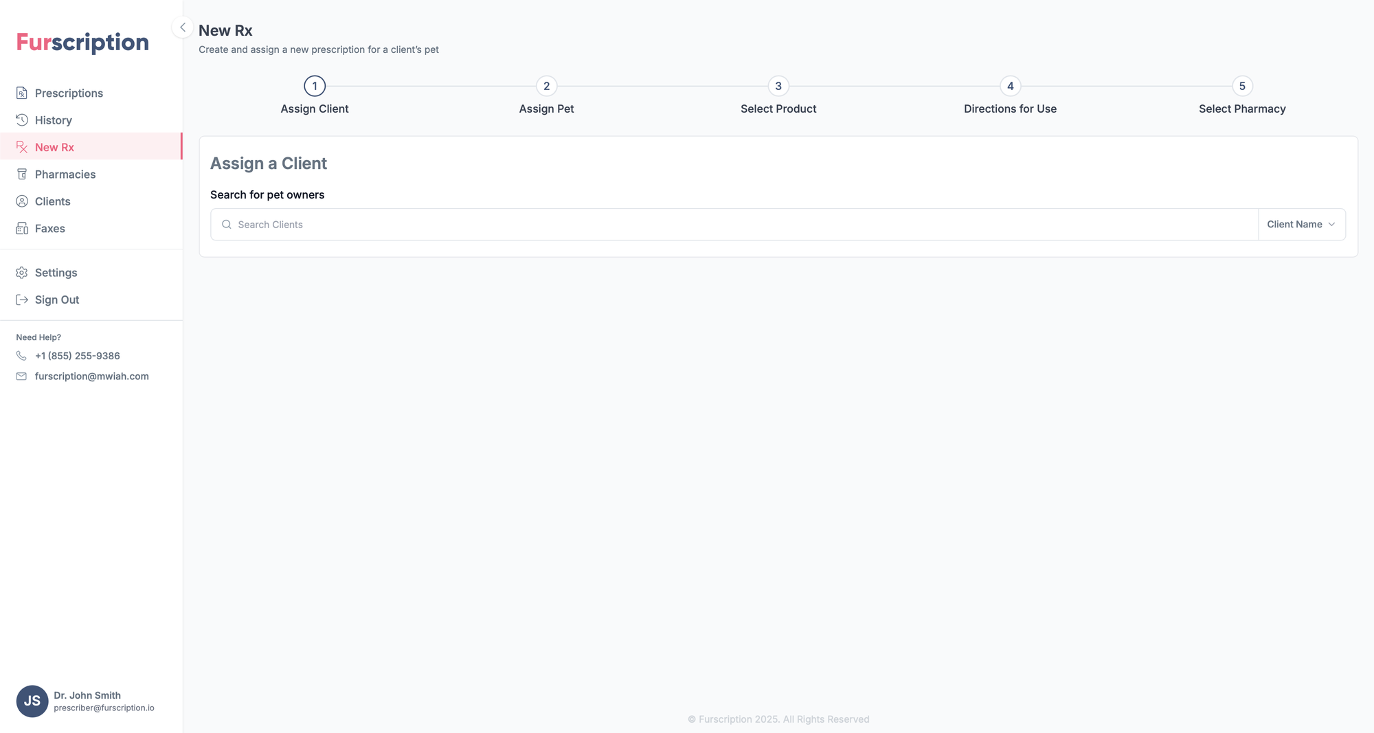
Every prescription begins with a client, so the first screen asks one thing: who is the pet owner? A single search field with a Client Name filter keeps it fast for a clinic that knows its regulars, and the five-step stepper across the top sets expectations before any data is entered.
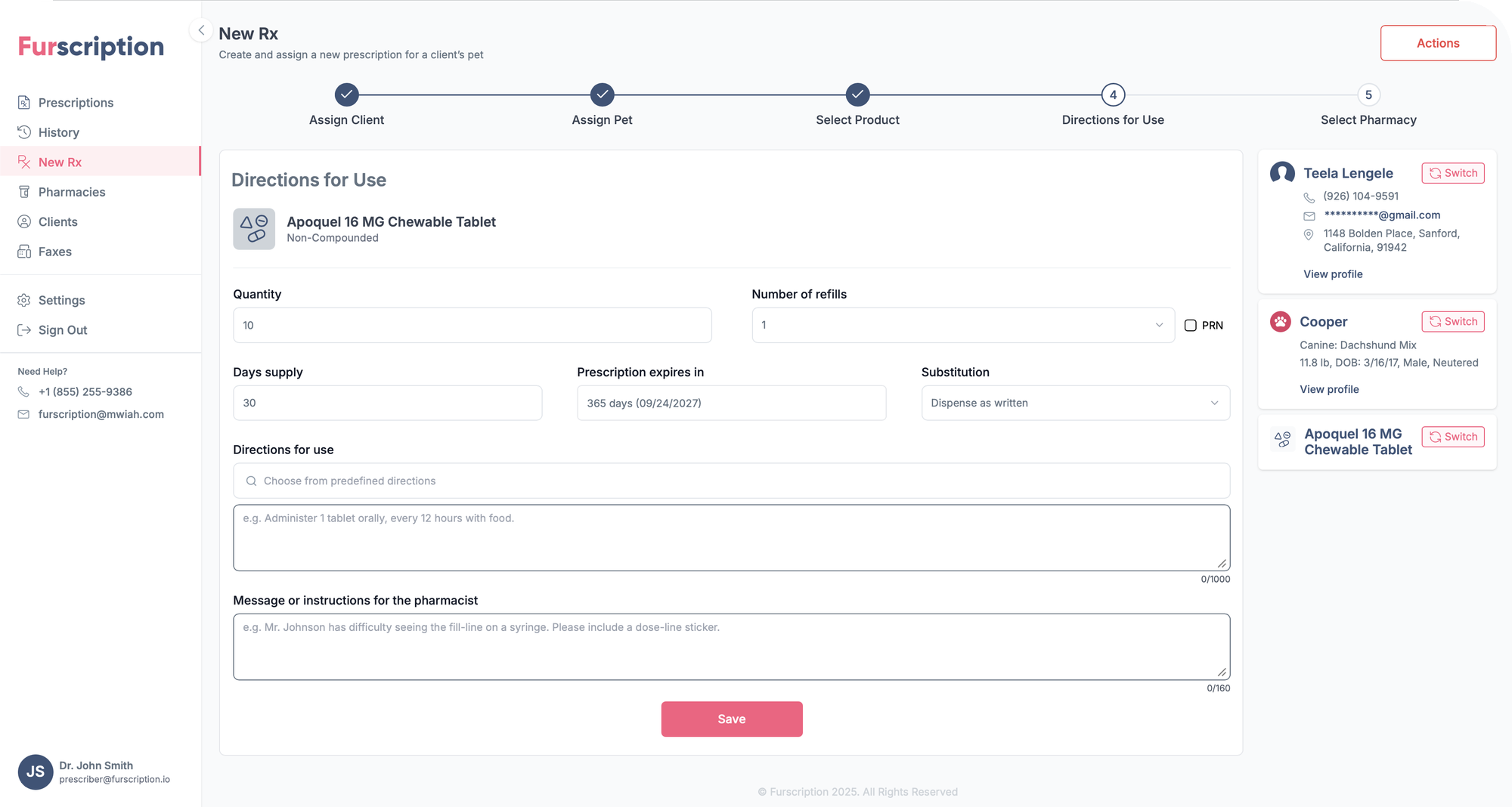
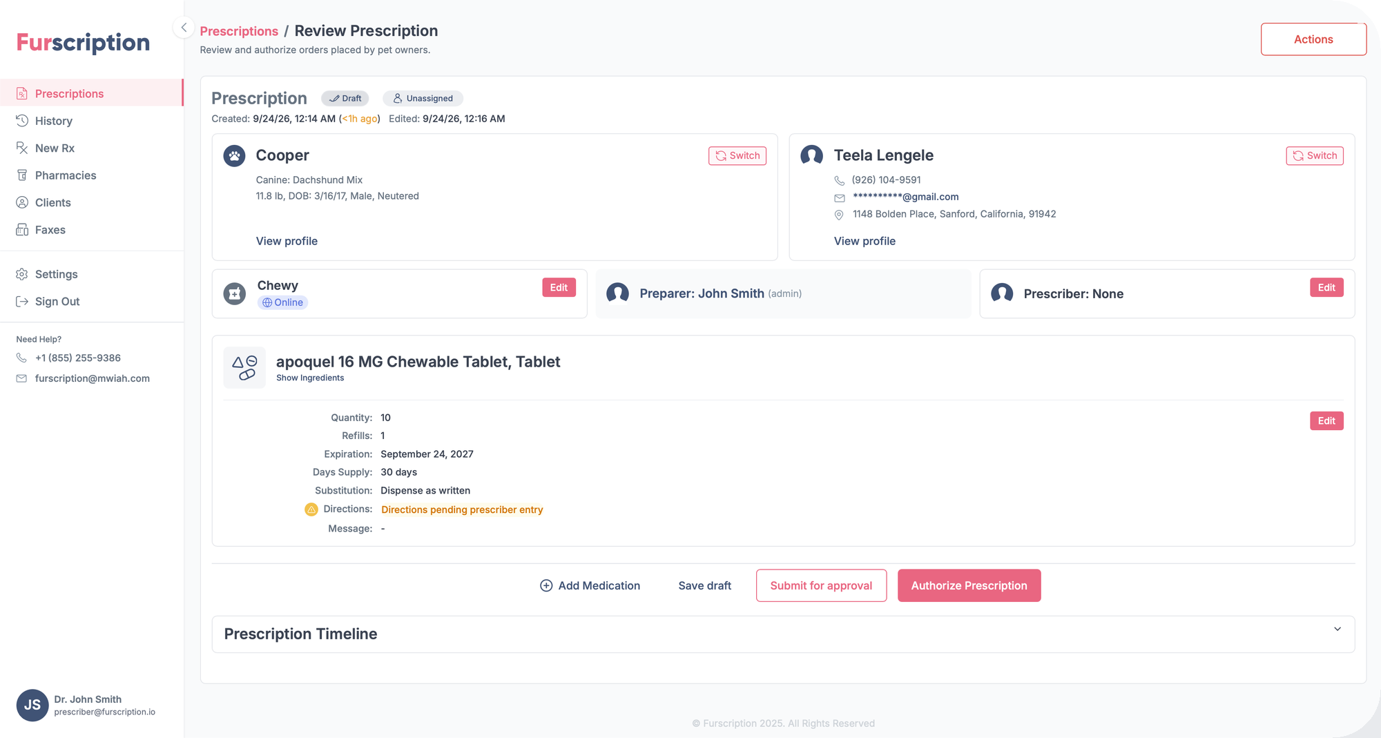
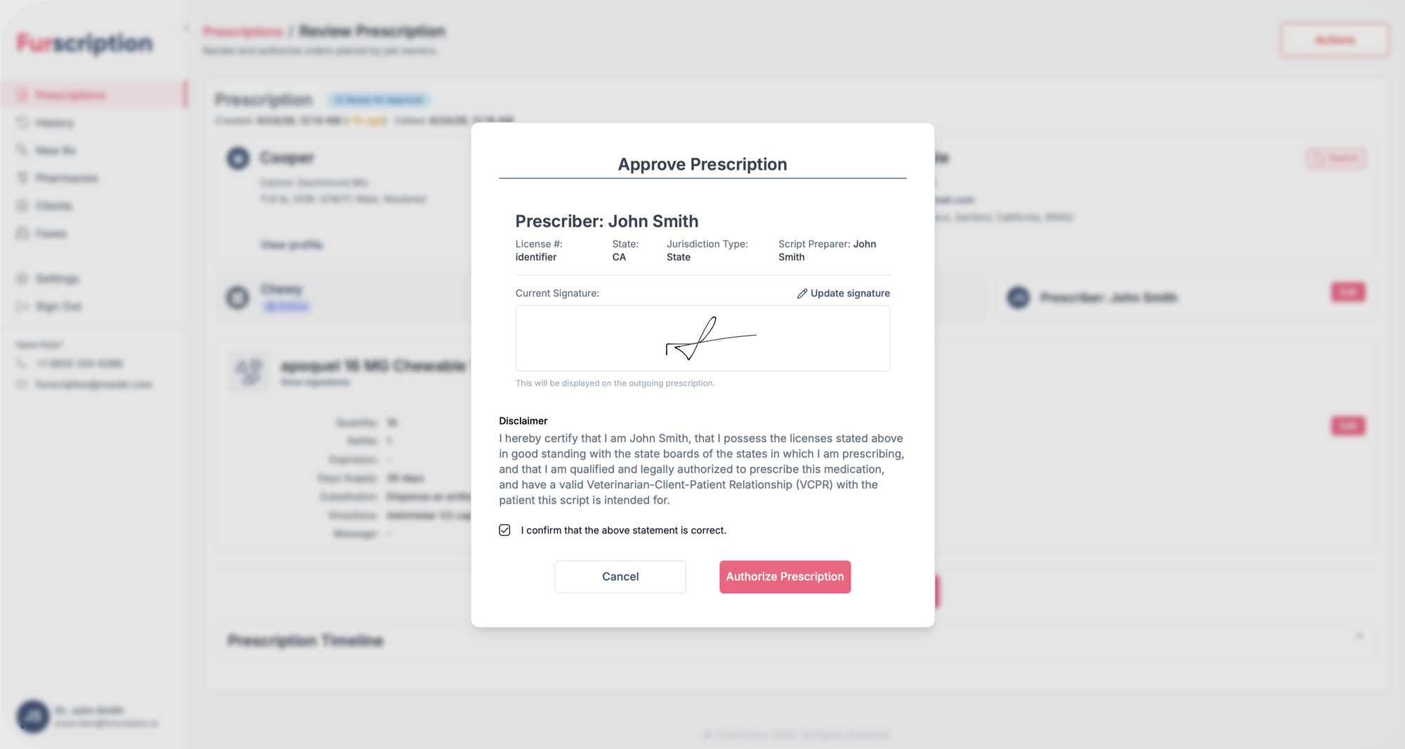
UX flow
Two paths to one outcome: the five-step wizard from scratch, or a refill request that already knows its client, pet and drug. Both return to the queue.
UI system
The pieces those colors get spent on, lifted straight out of the product. Buttons, fields, the stepper, the status pill, the card shape that repeats for clients, patients and products: the small set everything else is assembled from.

Complete, current and not-yet-reached, so progress is never ambiguous.


One filled button per screen; everything else is an outline.


The queue's three working states, and the pill a row carries.


Label above, hint inside, state carried on the border.

Predefined directions offered before free text, with a counter.
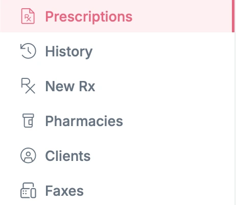
Selection is a tinted row with a coral edge: a state, not a button.
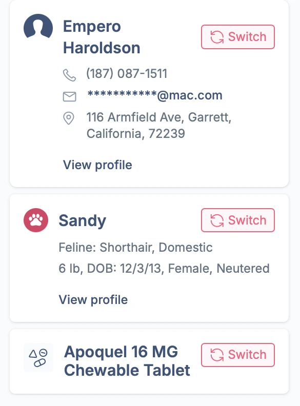
One card shape for client, patient and product, each switchable.
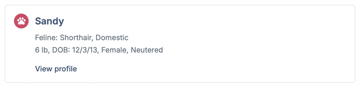
The same object whether it's a search result or pinned in the rail.

Column headers with the sorted column marked.
Color palette
Two brand colors and three neutrals pulled from them. The neutrals do almost all the work: in software a vet stares at for hours, color has to mean something when it finally appears.
Coral
#FB5C82
The 'Fur' in the wordmark. Held back for the one primary action in a view (Save, Actions, the active nav item) so the next step never has to be hunted for.
Navy
#3C5579
The 'scription'. Carries headings, the stepper and all record data. Putting the reading load on the calmer of the two brand colors keeps long tables from shouting.
Canvas
#F9FAFB
The page behind everything. A hair off white, so the white cards holding real records lift off it without needing borders or shadows.
Rule
#E7E9EC
Table headers and dividers. Enough contrast to group columns, not enough to compete with the data sitting in them.
Coral tint
#FDF0F2
Coral at low saturation, marking the selected nav item and active rows. Selection reads as a state, not as another button.
Design notes
The product is a queue and a wizard. The queue is one table of every prescription in flight, filtered to the three states that actually need a human, sorted so whatever is closest to lapsing rises to the top, openable between appointments and closable again. Everything else (the scoped filters, the record-card search, the context rail) exists so a vet never has to hold anything in their head from one appointment to the next.
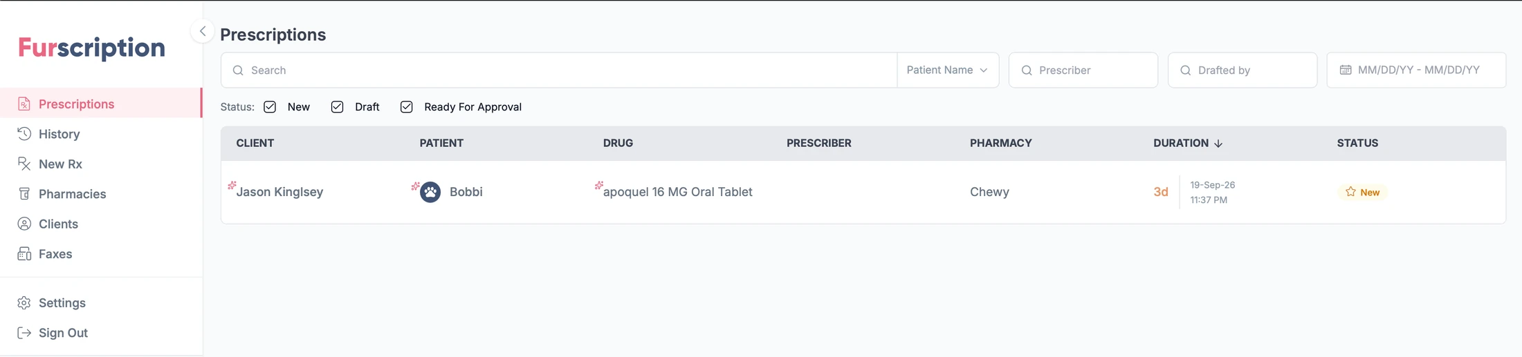
- Status filters open on everything still waiting on a vet.
- Four filters scoped to a field, rather than one fuzzy search box.
- Duration sorts the queue, so what's about to lapse rises to the top.
- Nav is named after the job (New Rx, Faxes), not after database tables.
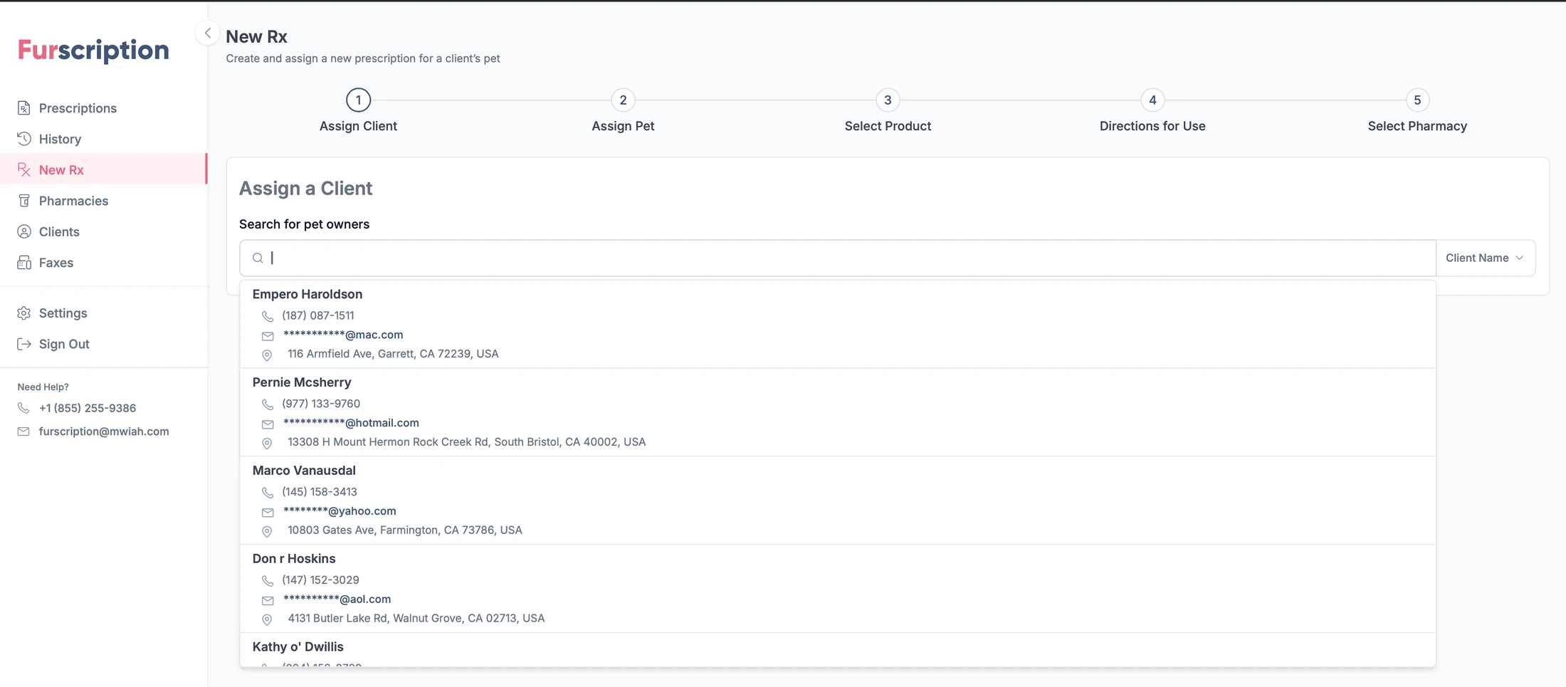
- Five numbered steps, visible from the first screen to the last.
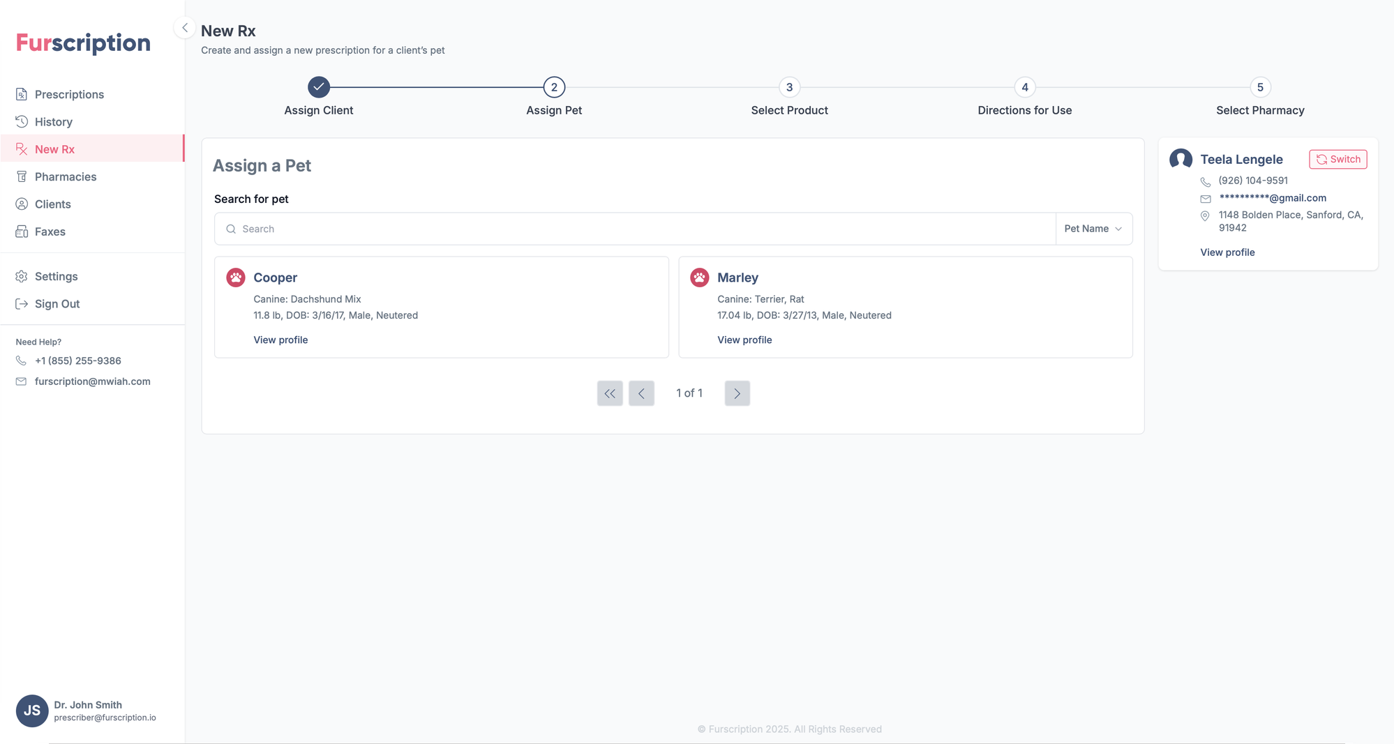
- Every result is a whole record (phone, email, address) so you can tell two clients apart at the moment you choose.
- Emails stay masked until there's a reason to reveal them.
- Search scoped by field, so a common surname stays findable.
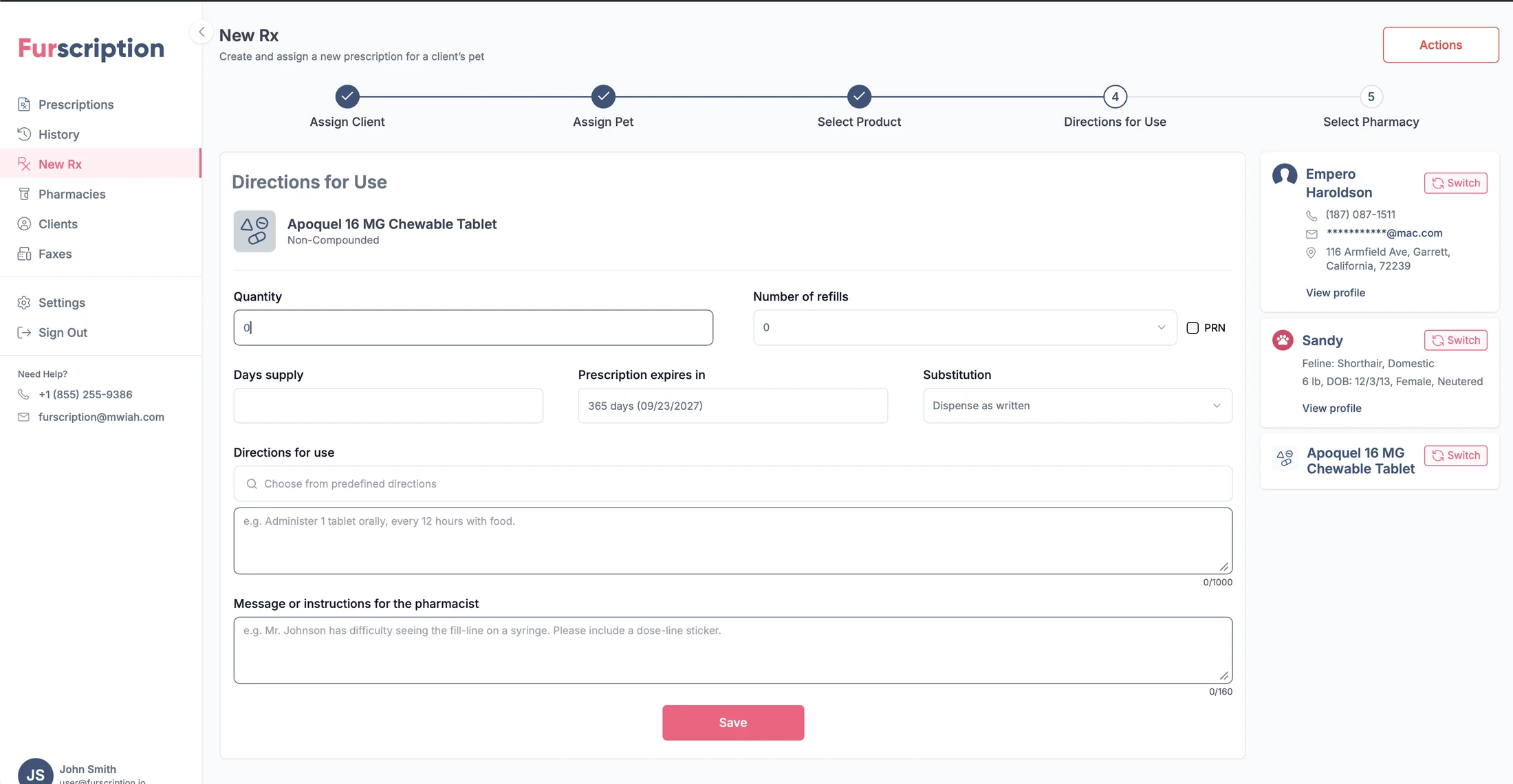
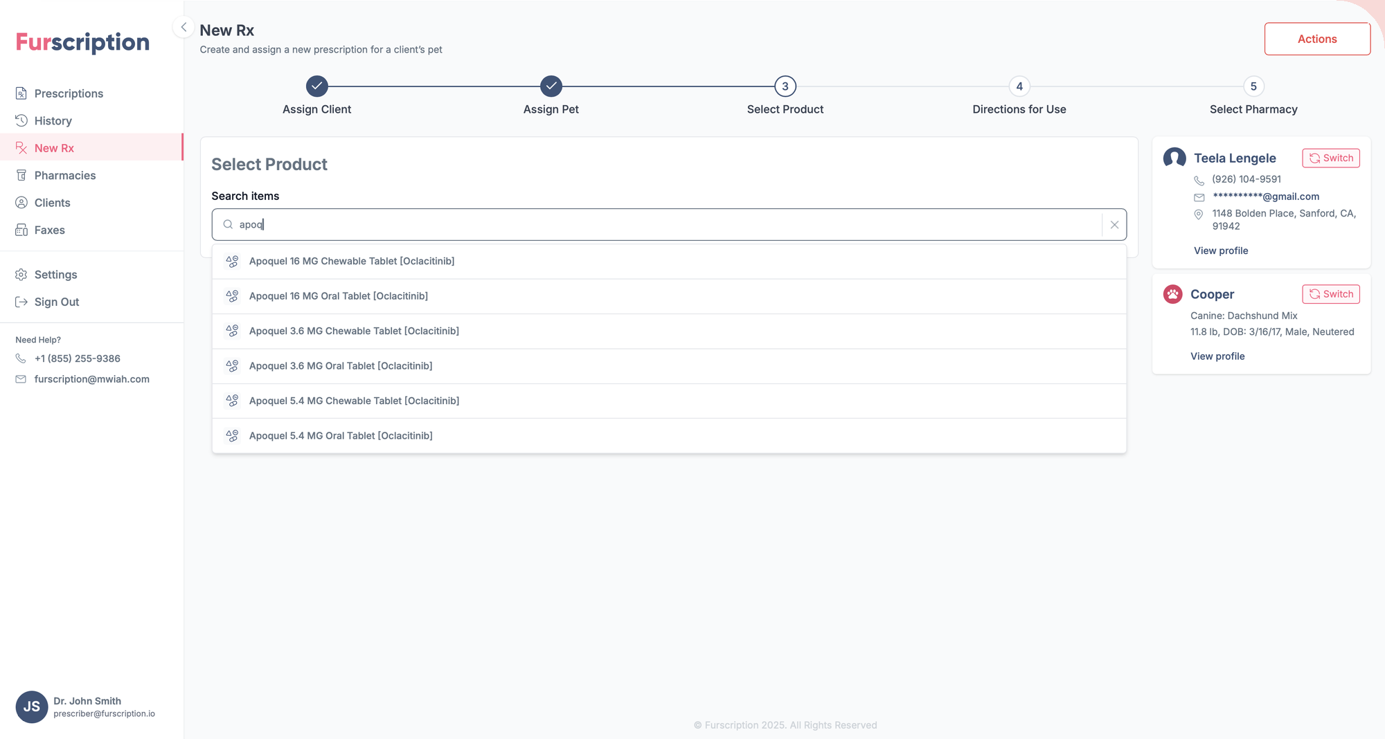
- The rail holds client, pet and drug, each with its own Switch: changing your mind doesn't mean backing out through three screens.
- Expiry computed from the prescribing date rather than typed in.
- Predefined directions offered first; free text stays available underneath.
- Counters on every field a pharmacist has to read back.
Outcome
The redesign held as the product grew. Furscription launched under Wag! and is now distributed through MWI Animal Health, reaching far more clinics than the original flows were drawn for, and the queue and the five-step wizard are still the structure the product is built around.